

How do i know which biocide i have (strong or normal) ?
My candy red has not faded yet in about ~1 week. Granted, i have a lot of it since my loop is ~2.5 liters... and i only put like 3 drops of biocide.


How do i know which biocide i have (strong or normal) ?
My candy red has not faded yet in about ~1 week. Granted, i have a lot of it since my loop is ~2.5 liters... and i only put like 3 drops of biocide.
If the biocide is mayhems biocide and bought with in the last 2 months then your fine. The new weekend down version has a slight blue to it were as the very strong version has a deeper blue to it.
its normaly about 1 drop per ltr so you running fine mate.
The pure form wich was undillted was
1 ml per 10 Ltrs for shock treatement
0.01 ml per 10 Ltrs for normal tratement (wich was way to strong for water cooling loops)
Now the new stuff is
1ml per 1 Ltr for shock treatement
0.01ml per 1 Ltr wich equates to 1 drop per ltr for normal use.
Shock treatement is if you had a fungi / algi build up and should be used to clean a system as it will kill every thing with in hours were as the normal tratement stops groth before it happens.
Top up once ever 3 to 6 months (other wise 1 drop every 3 to 6 months) to keep it running smoothly. Basicly a 5ml bottle should last 2 to 3 years. there is no need for a 10ml bottle unless you rebuilding you system all the time.
Last edited by mlwood37; 03-12-2010 at 02:27 AM.
Mayhems Lastest News -> https://www.facebook.com/Mayhems2009
If you need to direct contact me its michael at mayhems dot co dot uk.

No colour fading here.Originally Posted by mlwood37

(I'll post some pictures later and run an other temperature test to see if everything is still OK)
What you would like to know is what did he use as a coolant before he was using your dyes. There's a good chance that there was still some coolant in the loop after flushing his watercooling and that there was something in the coolant that doesn't like your dyes.
I don't see sediment in the reservoir or in the tubes so I'm guessing that the dye sticks to his watercooling blocks and/or rad.
Is there also a picture before the fading of the dye so we could see the difference?
Last edited by Alien Grey; 03-12-2010 at 04:46 AM.
Nope no sedement or any thing apearing and no blocks getting dyed or clogged.
Wich has got me thinking becuase like you and me we both seen it happen to green with the Biocide being way to strong but i never seen it since i fixed that problem. So my only though is along the line a reaction to some thing else that was put in the system to cause this to happen.I used the loop once before with deionized water and swiftech's mix. But i took it all apart. BUT i rinsed it all with hot hot "spring" water. Then blew the water out.
So i am thinking if there is a reaction to the small amount of spring water left in the loop
I have had 20 bottles stroed away now comming upto 12 months with the dyes in them and none have faded and allso the systems in our home again none have faded ect ect. So im stupped as to wather it his block , some kind of reaction to prev biocide or some thing else. this is another one of the pics sent to me
It looks like evry thing has gone accept the purple and that looks like 1 drop of pruple only that is left.
Been running tests this morning with UV pink and Candy red and a boat load of "raw" biocide and there has been a slight change but nothing on that scale so its totaly got me stumped. I even done a few phone calls and this has got quite a few ppl scratching there heads as it just shouldnt happen with any of the dyes i produce unless like you say its something in the equasion that i dont know about. Now if say a producer of a biocide is using either a bleech based product or some thing else i forgot its name then that will happen ... Makes me wonder what some of these produces are water cooling liquids use in there products.
Last edited by mlwood37; 03-12-2010 at 05:31 AM.
Mayhems Lastest News -> https://www.facebook.com/Mayhems2009
If you need to direct contact me its michael at mayhems dot co dot uk.
Anyway it's definitely not the nickel: i have way more nickel in my loop (2 full cover GPU blocks, 1 full cover MB block, all nickel plated) and the candy red is still steady in there.
It's a pitty that I don't have the testing samples. I could've done a test with the HydrX and the dye mixture to see what happens.
I think that the best way to prepare your loop for the dyes is to flush it and run a few days with pure water and than flush it again. Making the dye mixture with the Biocide in a glass of water to test it for a few days before putting it in your loop could be a good idea.
Ill sort you out some stuff once im sorted with the new bottles for the pre mix as im sort of spending alot of time trying to get the bottles and stickers and logos atm lol. Its a very fine balance between cost and sales atm and with out one the other ain happning hehe.
Mayhems Lastest News -> https://www.facebook.com/Mayhems2009
If you need to direct contact me its michael at mayhems dot co dot uk.
Well it didn't fade as fast as mlwood might have said here. I started to see changes after 1 week. Now this is after a little more then 2 weeks. What i used before was deionized water and the mixture swiftech has. Mix is suppose to be one bottle to every 500mm. But my mix was weaker. Used more water. The first time i didn't run with the nickel block. Then i took everything apart and rinsed it with hot water from the tap. I'm thinking there night be something there that could make a reaction. But as someone said, there could be leftovers from the other coolent. But it was flushed very well. All parts.
But i'm going to make 3 mixes with some drops from the tap, just distilled, and one i'll put in my other nickel block. Never used. Here is a before pic. It was uv pink, blue 2, candy red and purple all together..
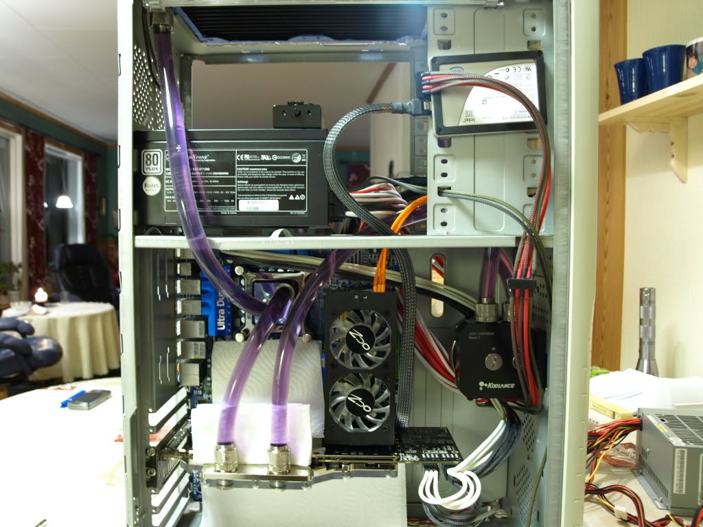
CPU: Q9650 MOBO: Asus P5E64 WS EVOLUTION PSU: OCZ MOD X STREAM 900W
GPU: HIS HD 4870x2 Coolance Water cooling RAM: 4x1gb OCZ DDR3 Platinum 1600 7-6-6-20
CPU COOLER: Swiftech GTZ waterblock HD: WD VelociRaptor 300GB SATA 3,5"
OPTICAL: Sony NEC Optiarc AD-7203S CASE: Nexus NZXT
Sorry for double post. But here are two mixes i put together. One just distilled water an dyes, one leftover water from the tap. 1 drop candy red, 1 drop blue 2, one drop purple and 2 drops uv pink. So now we will wait and see.
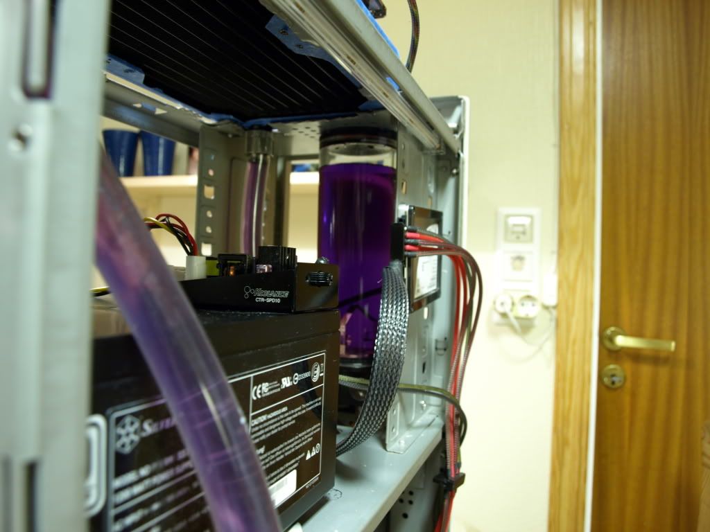
I'll get some in the block as well today i hope, with the ek compression fittings and tygon tubing. It's deep purple, but camera wants to show the blue inn it. My skills are just awful..

CPU: Q9650 MOBO: Asus P5E64 WS EVOLUTION PSU: OCZ MOD X STREAM 900W
GPU: HIS HD 4870x2 Coolance Water cooling RAM: 4x1gb OCZ DDR3 Platinum 1600 7-6-6-20
CPU COOLER: Swiftech GTZ waterblock HD: WD VelociRaptor 300GB SATA 3,5"
OPTICAL: Sony NEC Optiarc AD-7203S CASE: Nexus NZXT
keep us informed on its pregress ive miced up some more and placed it in the airing cubord with dionased water and 1 drop of biocide ill see happens.
Mayhems Lastest News -> https://www.facebook.com/Mayhems2009
If you need to direct contact me its michael at mayhems dot co dot uk.
@M40TURBO
If you want to flush your loop and don't want to waste distilled water why don't you use water from a bottle and not water from the tap?
Here's the result of my third test to see if the temperature is still the same and I also add two pictures to see if there's lost in colour and UV activity.
DeMi Water + 2% Anchor Water Wetting Agent + 30 drops dye with a room temperature of 18° Celsius.
Picture in daylight to view the colour.
Picture in darkness with UV light to view the UV activity.
The temperature is still the same and I don't see any change in colour or UV activity. My coolant mixture seems to be doing fine.
EDIT:
I've been working on my overclock profile and I've found that changing Ai Clock Twister in the BIOS from Moderate to lighter doesn't make any difference in performance for FSB 450MHz and DDR 1199MHz but it let's me run my Q9650 at 4.5GHz with less voltage so I've got less heat and made a new screenshot as a reference for the core temperatures. I could knock off 3° Celsius from the core temperature under full load with LinX and that's a good reason to use these BIOS settings for my 24/7 overclock.
All further tests will be done with these overclock settings.

Last edited by Alien Grey; 03-13-2010 at 08:58 AM. Reason: Added new screenshot for temperature reference
Whoops my fault i must have read it wrong. No its not you camra skills takeing pics of dye. It isnt easy in any way as diffrent light effects the differnt dye so ever one will allways get diffrent photos taken. Trustr ive taken pics of the same dye over and over again using diffrent levels and you never get the same pic twice.
How ever more to the point leep us informed on this problem and we hopefully can work togther to sort it out as im sure you wont be the only one who come across this problem. Id rather know now than later and try to resolve the issue now then later on down the line. If you run out of dye dont worry ill send you some more out so that your not out of pocket nither
Mick
Mayhems Lastest News -> https://www.facebook.com/Mayhems2009
If you need to direct contact me its michael at mayhems dot co dot uk.
What I'm reading here a lot on XS is to use coloured tubing. Coloured tubing FTW!!!
I don't think so. Have a look at my powercables from my OCZ EVOStream PSU. They are supposed to be blue in daylight. All the blue colour is almost gone. Only the parts that aren't directly exposed to UV and sunlight are still blue. This happened within a year so this is going to happen with coloured tubing as well and than you can replace them or use dye again. They still show up blue with UV light but not that dark blue anymore.
Also if something goes wrong with your coolant you're going to notice this very quick with clear tubing and with coloured tubing it might be already to late and you can take everything apart and start cleaning your watercooling parts.
With dyes if something goes wrong don't wait to long to drain and flush it and you're going to be fine.
a few small updates as such
1) New bottles on there way (should be here monday)
2) New telephone number
3) www.mayhemsdye.com and www.mayhemsdye.co.uk now active
4) VAT registraction now complete details on contacts page.
5) Logo on its second stage
6) Looking into out sorce new lables.
7) Undicieded if i use Black bottle or not for the pre mix to keep the UV aspect of the dyes used in them strong.
Child safty caps added to the pre mix range with fill spouts. No price hike.
Mayhems dyes have now sold over 1000 dyes Whoot. (happend last night).
New testing kits arrive next week. I even have a fancy microscope and various bits and bobs for contiual improvements of the dyes and liquids. All so if this go as planned im looking into a pure water system (II) to perchase. Means even better products produced. and vrious other things happing as well.
Still no resellers in the UK except for me ... maybe i havent got deep enough pockets to bribe them lol.
Last edited by mlwood37; 03-13-2010 at 11:41 PM.
Mayhems Lastest News -> https://www.facebook.com/Mayhems2009
If you need to direct contact me its michael at mayhems dot co dot uk.
new logos .. tbh im not impressed. think ill go back to no 3 of the first sheet ..

Mayhems Lastest News -> https://www.facebook.com/Mayhems2009
If you need to direct contact me its michael at mayhems dot co dot uk.
The 3rd one has almost an idea going on. But not very impressive indeed... still lacking that real logo that would set you apart. Think about EK or Danger Den who have very strong visual identity...


Well, more ideas can never hurt right? Well, here's a simple M$ paint idea for a logo.
I just like the idea of smaller logos myself...
well the idear is that the MD can be seprated off from the wording to create the logo and the wording is for letter heads, web sites ect ect and the logo (MD) is for stickers, products labels, etching ect ect.
Mayhems Lastest News -> https://www.facebook.com/Mayhems2009
If you need to direct contact me its michael at mayhems dot co dot uk.
Yeah i get that, but look at for example EK or danger den logos, they did a special graphics for the lettering, which can also be used for the full name (in the case of danger den). What i'm saying is the current iterations you showed have just regular fonts, with a slight colour gradient.. Apart from the 3rd one in last batch (with the stylized drop) which *just starts* to look like something original. The idea is to associate a simple yet original visual in the mind of customers to your brand - which standard fonts wont achieve. I know it's not easy at all
edit: also you could think of a separate drawing for the logo, ala Lian Li (their little circle thing), Silverstone, Swiftech (the star), etc.
Last edited by gmat; 03-15-2010 at 04:47 AM.
finally i got my Full mix kit
more pics
http://www.flickr.com/photos/kwscore/
5D II |14 2.8 |Σ 35 1.4|You Dont Need Telescope
Flickr
Cool but was the UV clear Blue that empty when it arrived. Im surprised as it doesn't look 5 ml to me. Im going to be changing the labels soon as well once the logo is complete.
a Little Update. This is the pre mix.

Main features of the bottles are a child safety cap, filling spout.
The child safety cap on all products like this is a must. Kids love coloured fluids and the safety cap is more important than a tamper evident cap. (yup it costs more but i don't care my kids all ways come first).....
From left to right we have
UV green, UV clear Blue, Clear, UV Purple, UV Pink, UV Blue, UV yellow / green
Still working on the labels ect ect. but any thoughts are welcome.
They will all be the same price (no extra for dyed liquid). And all of them work with mayhems dyes if you fancy enhancing the liquid.
After a boat load of tests and 25 pcs blown up, testing all the market leading brands of so called none conductive fluid ive decided that i will defo not be advertising the fact that this is no conductive as even the best brand out there blew up a PC with real life tests. Seemingly even giving the pcs a good scrub down and just leaving them in the open air for 1/2 hour was to much for any liquid.
The price point im aiming for is £5 a bottle Not inc p&p even with all these extras.
any thoughts guys ....
Last edited by mlwood37; 03-16-2010 at 04:53 AM.
Mayhems Lastest News -> https://www.facebook.com/Mayhems2009
If you need to direct contact me its michael at mayhems dot co dot uk.
Looks good.
Caselabs M8, i7 2600K W/ Apogee GTZ, 8GB Gskill Sniper 1600Mhz, ASRock Z77 Extreme 4, Intel 310 160GB, WD Caviar black 640GB, Powercolor 5870 W/Ek block, Seasonic X650.
there are a few things ive noticed when buying these from shop and the way bottles are posted. They all ways seem to come with no packing at all.
So again ive been working on this and this is the way all mayhem Pre mix will be sold.
This is the packing only still have to work on stickers.

Last edited by mlwood37; 03-17-2010 at 09:57 AM.
Mayhems Lastest News -> https://www.facebook.com/Mayhems2009
If you need to direct contact me its michael at mayhems dot co dot uk.
Looks secure to me!
Nice work you have been doing with this! No XS Discount code anymore?
~ <Mushkin Enhanced Alpha Team ~
GIGABYTE Reviews - X58A-OC ~ P67A-UD7 ~ P67A-UD4 ~ 5870 SOC
<Mushkin Reviews - 998966 Radioactive ~ 998826 Ridgeback ~ 998679 Blackline
Crucial Reviews - C300 SSD ~ Blue Tacer DDR3
 Posting Permissions


 Reply With Quote


Bookmarks